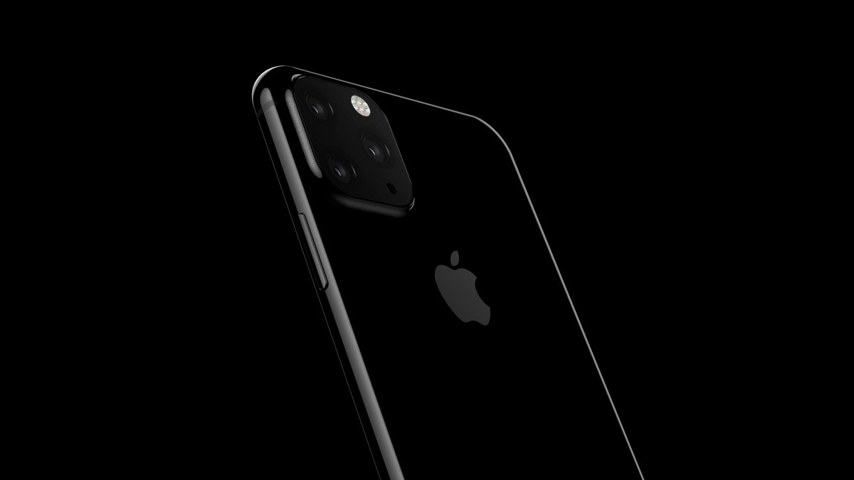
This is going to be a very interesting year in the smartphone industry. Android phone makers typically take cues from Apple and follow the company’s every move. Just look at all the shameless Android-powered iPhone X copycats that hit the market after Apple released the phone in 2017. In 2019, however, the smartphone landscape looks nothing like it did in late 2017 and throughout most of 2018. Instead, Android vendors have moved on to even better all-screen smartphone designs while Apple continues to use the same notched screen design it introduced on the iPhone X. And if you’re an Apple fan, we have some more bad news: It looks like things are going to get worse before they get any better.
According to reports from multiple sources including the most accurate Apple insider out there, the iPhone 11 series that launches later this year will sport a design that’s almost identical to the iPhone X and iPhone XS. That’s right, Apple apparently plans to use the same phone design three years in a row, just like it did with the iPhone 6, 6s, and 7. This year’s iPhone 11 is expected to look just like last year’s iPhone XS and 2017’s iPhone X from the front, and the back will be the same apart from frosted glass instead of clear glass and a new camera array. Those minor design changes aren’t exactly exciting, so one graphic designer decided to play with what we’ve seen so far and create an iPhone 11 concept that looks much better than what we’ve seen so far in leaks.
For those who need a refresher, here’s what we’re expecting from the iPhone 11 when Apple unveils it this coming September:

In a word, meh.
Graphic designer Hasan Kaymak apparently finds the prospect of an iPhone 11 that looks the same as the iPhone X and iPhone XS other than a bulbous camera bump to be just as boring as we do. In an effort to spice things up, he decided to riff on it a bit. He created a series of renders that imagine what the iPhone 11 might look like if it used the same camera design, but also mixed in some retro flavor design trends from 2019.
The result is a sleek iPhone 11 that has flat metal edges like the iPhone 5 and iPhone SE that everyone loves, but also a hole-punch display similar to the Galaxy S10. The resulting design isn’t perfect, but it’s certainly better than using the same design for a third consecutive year.
First, we don’t like the centrally located hole-punch cameras at all — the hole looks much better in a corner. On top of that, Kaymak’s design doesn’t leave room for any of the other sensors that the TrueDepth camera system needs in order to function. Face ID isn’t going anywhere, and the tech needed to hide the sensors under the screen isn’t yet ready for mass production. As a result, this iPhone 11 concept design is completely unfeasible. The modernized iPhone SE look is fantastic though, and we definitely prefer it to Apple’s current rounded edges. Maybe someday Apple will go back to basics and build an iPhone like this, but sadly it won’t be in 2019.
A video featuring Kaymak’s design is embedded below.
https://bgr.com/2019/04/03/iphone-11-leak-photos-show-better-design/
2019-04-03 13:26:00Z
52780259327997
Bagikan Berita Ini


0 Response to "This gorgeous iPhone 11 concept is probably much more exciting than the real thing - BGR"
Post a Comment